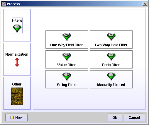
The processing steps involves filtering and normalization of the data.
Select the array you want to process by clicking in the Array cell. Click the Process Tab. The Process Batch area holds all the processes you want to carry out on an array. The processes have to be added one at the time. Click the Add Process button.

The Process winow offers Filtering, Normalization and some Other options.
One Way Field Filter - filters all spots with an attribute value above, equal or below a specified value.
Two Way Field Filter - filters all spots with an attribute value above, equal or below 2 times the value of another attribute.
Value Filter - filters all spots with a value above or below a specified value in at least one or all channels.
Ratio Filter - filters all spots with a ratio above or below a specified value.
String Filter - filters all spots with an attribute equal or not equal to a regular expression.
Manually Filtered - filters all spots manually marked to be filtered in Spot View or Replicate View.
All filters have a ![]() Filter button. Press this button to see how many spots that will be filtered by this filter.
Filter button. Press this button to see how many spots that will be filtered by this filter.
Normalization can be carried out on the entire array, a block or a group of blocks of the array. The groups are defined during the Quality Control.
Median - this is a type of single-parameter linear normalizaion. It normalizes the data so that the median intensity is the same across the entire array.
MPI - for method description see
Lowess - normalizes intensity dependent effects of the data, particularly at low and high intensities. These effects may cause a "banana" shape of the data, which cannot be corrected by linear normalization.
When clicking any of the types of normalization, a window showing the before and after normalization is opened.
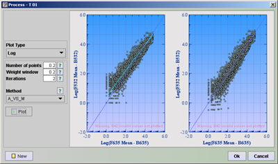
Set the Plot Type and other parameters. Click on the question mark behind the parameters to get information on the particular parameters. Click the ![]() Plot button to see the before and after normalization plots.
Plot button to see the before and after normalization plots.
Plot - if you want to see a plot of the your data after having done some filtering or normalizations, add a Plot process and move it to the position right after the processes you want to see the result of. Click in the run column of the plot process. This performs the above processes and plots the graph result. You can set different colors for filtered and non-filtered spots. You can also choose whether you only want to plot the filtered or non-filtered or both by checking the check-boxes.
Value Boundary - Set all fields with value greater than, equal to or less than a certain value to a specified value. This can for instance be used to setting a floor value for very low intensities. Use the target button and filter the attributes you want to keep as they are, without being replaced by a floor value.
Spike Viewer - Spike Viewer is used to examine the controls printed on the arrays.
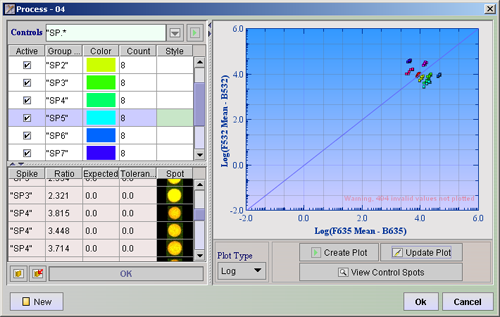
On the left of the divider there is a search field and two tables. Locate the controls by typing a regular expression in the text field behind the label Controls and press ![]() . The 10 last used search phrases are saved and can be selected by clicking the
. The 10 last used search phrases are saved and can be selected by clicking the ![]() button. The search result will be displayed in the top table. All spots from one control that are printed on different places around the array, make up one Group. The number of members to a group is displayed in the Count column. Each group get its own color. You can change these colors by clicking on the colored rectangles and choosing a different color.
button. The search result will be displayed in the top table. All spots from one control that are printed on different places around the array, make up one Group. The number of members to a group is displayed in the Count column. Each group get its own color. You can change these colors by clicking on the colored rectangles and choosing a different color.
Choose the Plot Type and press ![]() Create Plot . The spikes checked in the Active column will be plotted with their specific colors, in the graph display window. Since you know what the ratio for the controls should be, the plot lets you see if the data are skewed in any direction. If you now look at the bottom table, you can see each of the control spots (or spikes) listed.
Create Plot . The spikes checked in the Active column will be plotted with their specific colors, in the graph display window. Since you know what the ratio for the controls should be, the plot lets you see if the data are skewed in any direction. If you now look at the bottom table, you can see each of the control spots (or spikes) listed.
Click Copy Controls to Registry ( ![]() ), then click the Open Spike Control Registry (
), then click the Open Spike Control Registry ( ![]() ). Here you can set the expected ratios and tolerance limits (Setting the value 1 means tolerance of +-1) . Click ok. Look back at the bottom table. All spikes that have ratios within their expected ratio + tolerance limit will have a white row, while the others will have rows that are colored red.
). Here you can set the expected ratios and tolerance limits (Setting the value 1 means tolerance of +-1) . Click ok. Look back at the bottom table. All spikes that have ratios within their expected ratio + tolerance limit will have a white row, while the others will have rows that are colored red.
Click the ![]() View Control Spots button. This will import all the control spots from the array and display them in the Spots column of the lower table. You can now examine the spots to see if the same control looks the same across the array. This may also help to explain the reason if any spikes have ratios outside the limits. You can add other controls that have a different regular expression by locating them the same way as before.
View Control Spots button. This will import all the control spots from the array and display them in the Spots column of the lower table. You can now examine the spots to see if the same control looks the same across the array. This may also help to explain the reason if any spikes have ratios outside the limits. You can add other controls that have a different regular expression by locating them the same way as before.
Click Copy Controls to Registry ( ![]() ). This will add the new controls to the registry. To plot the new controls, you only need to
). This will add the new controls to the registry. To plot the new controls, you only need to ![]() Update Plot. It should only be necessary to press the
Update Plot. It should only be necessary to press the ![]() Create Plot button the first time, or every time you change the Plot Type.
Create Plot button the first time, or every time you change the Plot Type.
Click Ok to add a process to the Processing Batch, New if you change your mind and want to go back to the window where you select the processes, and Cancel to go back to Processing Batch without adding anything.
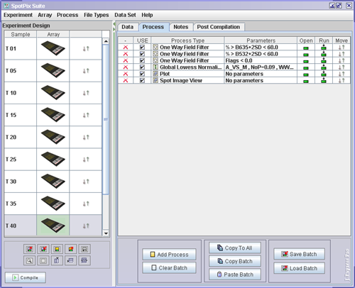
The processes listed in the Process Batch will take affect first when you press the ![]() Compile button, which is located in the lower left hand corner of the SpotPix Suite window. This means that you can play around with different processes and see the effect of doing different types of filtering and normalizations, before the final dataset is created and added to the J-Express Pro project tree.
Compile button, which is located in the lower left hand corner of the SpotPix Suite window. This means that you can play around with different processes and see the effect of doing different types of filtering and normalizations, before the final dataset is created and added to the J-Express Pro project tree.
To run the processes, click one of the rows in the Run ( ![]() ) column. This will process all the processes from the top of the list, down to the row you clicked. If you wish to change the order of which the processes are carried out, move a row by clicking and dragging in the Move (
) column. This will process all the processes from the top of the list, down to the row you clicked. If you wish to change the order of which the processes are carried out, move a row by clicking and dragging in the Move ( ![]() ) column. If you want to reopen any of the processes click in the Open (
) column. If you want to reopen any of the processes click in the Open ( ![]() ) column of the row of the process you want to open.
) column of the row of the process you want to open.
If you want the same processes to be carried out on all of your arrays, click the ![]() Copy To All button.
Copy To All button.